Decorating a space in terms of colour is as easy as 60-30-10. Don’t believe me? Take a look at some rooms in magazines or in Designers’ Portfolio. You’ll notice that the rooms you like the most are almost invariably divided into percentages of 60-30-10. Why this works is anybody’s guess. Perhaps it is the human tendency to see an overall theme in the 60 percent hue, unifying the coloration. The 30 percent provides visual interest and the 10 percent, not unlike jewelry, provides that little spark of sparkle.
So, when decorating a particular room, divide the colours into percentages:
60% of a dominant colour
30% of a secondary colour
10% of an accent colour
When you think about it, this colour breakdown is similar to a man’s business suit:
60% of the outfit’s colour is the slacks and jacket
30% of the outfit’s colour is the shirt
10% of the outfit’s colour is the tie
Translated to a room setting, it typically means:
60% of the room’s colour is the walls
30% of the room’s colour is the upholstery
10% of the room’s colour is, say, an accent piece or a floral arrangement
Choose a Colour Scheme
Trying to decide on the right colour scheme for a room or an entire home can be difficult. You can simplify the process by using your colour wheel and narrowing down your choices to two colour schemes. There are more, of course, but these are the most effective and provide a great place to start.
Complementary Colour Scheme
Complementary colours are across from each other on the colour wheel, such as red and green, blue and yellow, or purple and orange. Rooms decorated with a complementary color scheme tend to provide a clear separation of colors and often are more formal and more visually challenging. Complementary colour schemes should be used in the more formal areas of the home — for example, the living room or dining room.
Analogous Colour Scheme
Analogous colours are next to each other on the colour wheel, such as yellow and green, blue and violet, or red and orange. Rooms using an analogous colour scheme typically are more causal, restful and muted in terms of coloration. This colour scheme is best used in the more informal areas of the home. Family rooms, dens and bedrooms — places where you’re searching for rest and recovery from the day — look and “feel” great in analogous colours.
Don’t Forget the Black
This is an old adage in interior design. By adding a black element — say, a black box, lampshade, picture frame or other accent — you clarify and enhance all the other colours in the space. Try it — it really works!
Follow Nature’s Lead
Most people err, not with colour, but with value. Value is the relative lightness or darkness of a colour. Often you’ll see a space that is not balanced in terms of value: one side of the room is too dark (therefore, “weighty” or “heavy”) versus the other side, which is light in value and tends to “float away” visually. Try designing your interior space by replicating the colour values of the outside world. After all, interior designs are basically our attempt to imitate Mother Nature, who is a great colourist!
Choose darker values of colour for the floor (ground), medium values of colour for the walls (trees and mountains) and light values of colour for the ceiling (sky). If you divide your colors by value from dark to light as you decorate “vertically” in the room, you’ll get an interior design that looks good every time.
Pull From the Pattern
To help you choose a colour scheme, look at the colours in the largest pattern in the room first, be it drapery, upholstery fabric, an Oriental rug or a large artwork. Then choose colors based upon that piece. This is much easier (and less expensive) than painting the walls a particular colour and finding that absolutely nothing else on the planet, let alone in your room, will match it. In other words, if your favorite piece of art is red, black and gray, you can choose the gray to be 60 percent, the red to be 30 percent and the black to be the 10 percent — or the red could be the dominant colour with the gray and black taking secondary and accent roles.
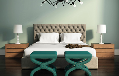
Duvet and Pillow with Rose Touches
Pick your colour scheme from the largest pattern featured in the room. This bedroom uses the colours of the duvet throughout the space. Design by Erinn Valencich.
Keep in mind that colours on the market are driven by economics. The colour industry comes out with standard colours for particular years (anyone remember their harvest gold kitchens from the ’60s?). These standardized colours are then used for cars, appliances, fabrics — you name it!
These colours will change depending on the “colour beneath the colour.” In the ’80s colours had blue beneath the basic colour, therefore the fashionable colours at the time included mauve (a red with blue undertones) and sea foam (a green with blue undertones). Today the trendy undertone colour is yellow, so you get “sage” greens, “hot” reds and “lilac” blues. Keep that in mind when you’re deciding on your colour scheme.
Flow the Colour
In order to create a flow of colours from one room to another, simply choose a colour you’re using in one room and restate it in a different way in an adjoining space. For example, if your sofa is green, use the same green for seat fabric in the dining room.
Use the colour in larger or smaller degrees as you move about the home. That same green from the living room sofa mentioned above can also translate as, say, lampshades in the family room or place mats in the kitchen.
Consider Contrast
A high-contrast space (a room that uses light and dark values of colours in combination — for example, deep burgundy with light gold) appears clearer and more highly defined than a space that incorporates low contrasts (say, saffron yellow with sage green). So think about using high contrast to enhance the formality of a room and low contrast to introduce soothing qualities.
When paired, black and white (which, by the way, are not colours but rather the addition or subtraction of light) are somewhat formal in appearance, not unlike a tuxedo. White with beige, however, has a low contrast and a feeling of calmness. Combining white and black with gray is very low key and also creates a restful space.
Get Emotional With Colour
We all associate colours with what they represent. In our minds, red may represent fire, blue the air and sea, yellow the sun, and brown and green often represent trees. These are generally considered to be emotional responses to colour as opposed to intellectual responses. Use these emotional associations to their greatest effect in a space by deciding on what emotional impact you want the room to have. Would you like it to be lively? Choose reds and yellows. If you prefer subdued, try blues and browns.
The emotional impact of colour should reflect the activities being performed in the space. If it is for rest, such as a bedroom or family room, choose darker values of colours that relate to restfulness such as greens, blues and browns.
Think About Local and Seasonal Colour
By studying colour schemes from the past — Victorian, arts and crafts or, perhaps, 18th century, for example — you can build a room’s colours quite simply by incorporating these already-accepted colour schemes. By using colours from your locale, be it the Southwest or New England, you easily can choose colours that reflect the area in which you live.
Seasonal colour variations are another painless way to choose colours. Fall colours such as mustard yellows, russets and browns will create a calm and subdued space, perfect for resting. Spring colors, on the other hand, are more uplifting; pinks, lilac and saffron yellow impart a naive, fresh look to a room.
Live With Colour Before You Buy
When shopping for upholstery fabric, furniture finishes, window treatments or rugs, always ask for a sample to take home to see in the space you are decorating. Then leave it in the room for a couple of days and see what the colour looks like in the different kinds of lighting used in that space. Pay careful attention to how the samples look during the times when the room will be used the most.
If the room is used most often at night, after everyone is home from work and school (under the “artificial” light of lamps), check out the colour during the late afternoon and evening hours. If the room is used during the day, when there is an abundance of natural sunlight, check out the colours during the morning and early afternoon hours.
The direction the room’s windows face (where the natural light is coming from) will also impact how a colour appears in the room. Dark colours tend to look darker in rooms with northern exposures. You may want to lighten the colour values of your choices a bit to reflect this in such spaces. The opposite is true for rooms with southern exposures: colours appear lighter.